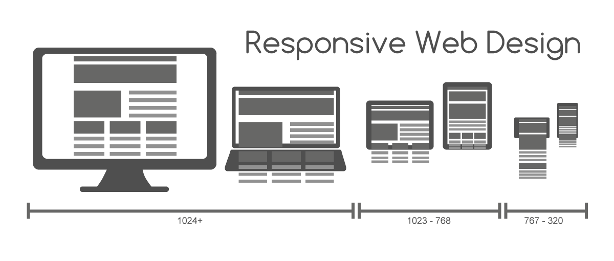
Pull out your phone and visit your own website. How does it look? If you have to pinch, zoom, or squint, you're losing customers — right now, today.
The Numbers Don't Lie:
• 61% of all web traffic comes from mobile devices
• 53% of users leave a site that takes more than 3 seconds to load
• 74% of users are more likely to return to mobile-friendly sites
What Mobile-First Actually Means:
It's not just making your desktop site "fit" on a phone. Mobile-first means designing for the phone experience FIRST, then expanding to larger screens.
Key Elements of Mobile-First Design:
1. Touch-Friendly Navigation
Buttons should be large enough to tap with a thumb. Menus should be simple. No tiny links crammed together.
2. Fast Loading Speed
Mobile users are often on cellular data. Compressed images and clean code make a huge difference.
3. Readable Without Zooming
Text should be at least 16px. No horizontal scrolling. Content should flow naturally in a single column.
4. Click-to-Call Buttons
If someone searches for your business on their phone, they should be able to call you with one tap.
Google now ranks mobile-friendly sites higher. If your site isn't mobile-optimized, you're not just annoying users — you're invisible to new ones.
Извадете телефона си и посетете собствения си уебсайт. Как изглежда? Ако трябва да щипнете, увеличите или присвиете очи, губите клиенти — точно сега, днес.
Числата не лъжат:
• 61% от целия уеб трафик идва от мобилни устройства
• 53% от потребителите напускат сайт, който се зарежда повече от 3 секунди
• 74% от потребителите са по-склонни да се върнат към сайтове, удобни за мобилни устройства
Какво всъщност означава „мобилно ориентирано“:
Не става въпрос само за това вашият десктоп сайт да „пасне“ на телефон. „Мобилно ориентирано“ означава ПЪРВО проектиране за телефонното изживяване, а след това разширяване до по-големи екрани.
Ключови елементи на „мобилно ориентирания“ дизайн:
1. Навигация, удобна за докосване
Бутоните трябва да са достатъчно големи, за да се докосват с палец. Менютата трябва да са прости. Без малки връзки, струпани една до друга.
2. Бърза скорост на зареждане
Мобилните потребители често използват мобилни данни. Компресираните изображения и изчистеният код правят огромна разлика.
3. Четлив без мащабиране
Текстът трябва да е поне 16px. Без хоризонтално превъртане. Съдържанието трябва да се прелива естествено в една колона.
4. Бутони за кликване и обаждане
Ако някой търси вашия бизнес на телефона си, той трябва да може да ви се обади с едно докосване.
Google вече класира по-високо сайтовете, удобни за мобилни устройства. Ако вашият сайт не е оптимизиран за мобилни устройства, вие не сте просто досадни потребители - вие сте невидими за новите.